# Introduction and main components
The PlexusLAB web platform offers all the tools necessary for the configuration of a system, which vary from the configuration of the users, to the setting of connected devices, to the definition of alarms, to the production of graphics panel for monitoring and management of the state, passing from of various customized functions to be executed to control the entire process.
The web platform is made up of always visible sections and dynamic content.
This chapter describes the sections that are always visible and the functions they offer.
The following chapters will describe the individual features; keep in mind that some of them could be hidden depending on the type of user during the sign in process, due to a question of permissions associated with it. Refer to the Users for more information.
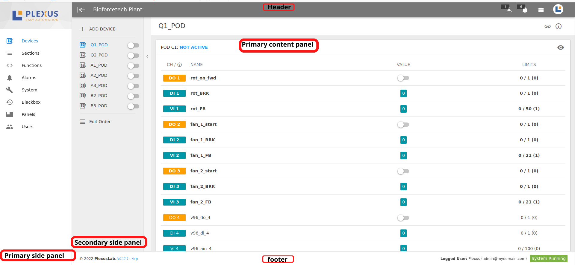
# Header
The header is the upper part of the window, a dark grey bar, that shows informations and buttons described here:

| Icon | Functionality | Details |
|---|---|---|
| calendar_view_day | Sidebar | Open/close sidebar |
| - | Label | Server name, can be modified by accessing system settings |
| perm_identity | Users | Displays the number of users logged into the system |
| view_module | HMI Panels | Link to HMI panel |
| notifications_none | Alarms | Displays the number of active alarms |
 | Plexus | Opens settings |
# Menu button
Click to open a popup menu that shows these actions:
| Icon | Functionality | Details |
|---|---|---|
| file_download | Export | Export plant configurations |
| file_upload | Import | Import a previously exported configuration into the plant |
| file_download | View Data | Download configurations into a CSV file |
| exit_to_app | Logout | Close an active session on web platform. For security reasons, it's always recommended to logout at the end of operations so that nobody is able make changes by accessing to your PC while you are not watching on it |
# Import project
This functionality allows to make a total or partial configurations import from another projects.
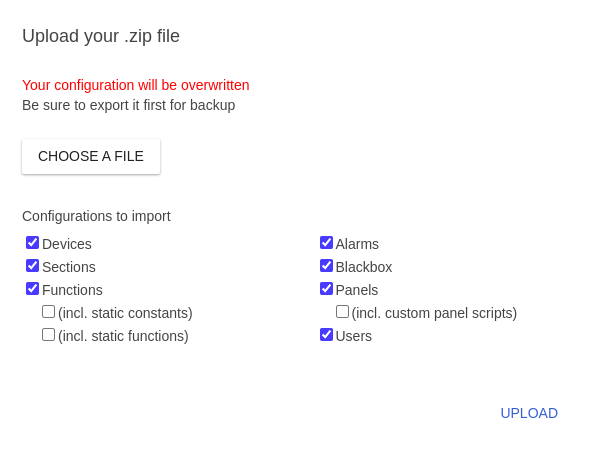
TIP
Sometimes it's useful to import only some parts of an exported configuration, so that users, constants and other things can be properly defined for the system you are working on.
# Footer
Footer is the bottom part of the window. Here is a brief explanation:

# Installed software version and info
The first information shown is the current version of the installed system software, in M.m.v format, where
- M = Major version number, whose advancement indicates a completely renewed software version, and which usually involves breaking changes with lower M versions;
- m = minor version number, whose progress indicates a version with new features, which typically do not involve breaking changes with the same version of M;
- p = patch number, the progress of which indicates a software version that includes fixes and corrections to problems found on previous versions, with the same M and m.
If the installed version is the latest, a “Help” link is shown which opens a popup with general information on how to perform an update.
Conversely, if a more recent version is available, the link shows an indication "New version available! (M.m.v) "with its identification number; in this case, if necessary, read up on the changes made by the new version and, if possible, update the system following the instructions in the popup.
# User logged in
Name of the user with whom you are currently logged into the web platform.
# System status
Shows the current state of the system, which can assume one of the following states:
- LOADING: first moments after login in which the platform waits for the first response from the system;
- System Running: the system is functioning; more precisely, the status of the function service is active and is running correctly on the machine;
- System Stopped: the system (red color) is stopped
# Side Panel
The Side Panel on the left side of the screen allows you to show the selected functionality in the central part of the page, highlighted in blue.
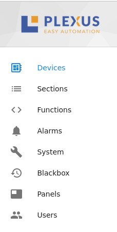
The various functions are described in detail in the next chapters.
It can be hidden or expanded using the button in the header, to the left with respect to the project name.
# Primary View Panel
The central part of the screen shows the content selected by means of the Side panel.
Devices →